Here's the result of a three months work: The rennovation of my own brand, the rennovation of the
Shak - Design and Illustration Studio Identity. I wanted something sober and light. The symbol was thought based on three main design and art fields:
Illustration, Graphic Design and Photography. Also, it has concepts of highness: The symbol was abstracted from a mountain.
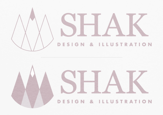
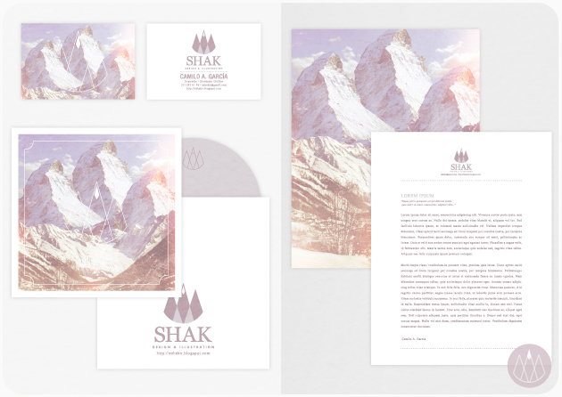
I needed a complementary graphic. Based on the Mountain concept, i bring to life the three spikes mountain:

Here's the use in Prints and Web applications (This blog and my facebook page):


ESTOY ORGULLOSA DE TI <3.
ResponderEliminar