miércoles, 27 de noviembre de 2013

AFI - A Deep Slow Panic

Hallo! It's been a while since my last post. In this moment, I'm participating in a Creative Allies contest. It's about the next AFI single called 'A Deep Slow Panic'. It would be really great If I'm the winner. AFI is one of my favorite bands since ever. So, this is a result and a little story behind this artwork.

Vote here please:
http://creativeallies.com/creations/hpc3/contests/886/create-single-artwork-for-afi


"Fear and Panic. A Slow panic. This is a story of a hunted animal that runs across the forest. Its killer aim at it with an arrow on fire. When it runs, it burns the forest. Its death represent the death of the other sorrounding species. A massive death provoked by a scared being. A deep slow Panic."


miércoles, 28 de noviembre de 2012

Star Wars Anatomy

Concept work made for The Anatomy of Star Wars event. I love the Anatomy concept and Star Wars is one of my favourite sagas, so i decided to use this event as an excuse to develop it. Chewbacca of course, is one of my favourite characters of the movie.


Nunca Más

This is an experimental work made for a book i made few years ago, of one of my favourite authors ever: Edgar Allan Poe. The book is a short storys compilation. It's a personal work based on the work of Jordan Metcalf.


Concept Work - 4Cuartos

Concept work developed for 4Cuartos, one of the biggest rehearsal rooms and recording studios here in Bogotá, Colombia. They have this pet, called Cory, and the concept is based on the Underground music and the constant support they give bands and musicians. Unfortunately, the client didn't approve the work, therefore is a concept work. Work developed with: Sergio Borrero Ferrer, Pablo Méndez and Nicolás Serrano.


Those 'Antes de Correr'

This was a really interesenting project to work with. It's another music artwork. Consist in Cd cover and Cd layout, a vintage chromed logotype (The logotype was created by Sergio Borrero Ferrer and i made the chrome part), website and iPhone and iPod stuff for the Bogotá band THOSE. The whole project was developed by Me and CASA AMPERSAND. This is where I work right know, and it's beautiful to have that great work group. Special thanks to them: Sergio Borrero, Pablo Méndez, Daniela Castiblanco, Diego Pinilla, Juan Mattos, Jóse Malagón and Johanna Quijano.


Solar Rays

This poster was a really quick exercise proving the benefits of improvisation: Design and illustrate without knowing a real end. Just taking some ramdom photos and compose them until you have a functional result.


World Fair 2045 Pt. II

This is the second part of World Fair 2045. This is basicaly is the explanation of what is in the fair: Three different exposed Cities: Mars -o-rama, an amusement park in Mars; Atlantipoly, the recreation of Atlantis in the future and Glasstopia, the city with Glass foundations, buildings and highways. I made a brochure explaining each part of the project. Also there are some souvenirs. Welcome to the future!


viernes, 22 de junio de 2012

Illustration - The Vitruvian Man: Evolution


This is what I called Nostalgia. I've been drawing since i was like four years old: all my life has been around art, but at the age of 16, I decided to get into the digital illustration world. I started using programs as Macromedia Fireworks and PS, and I created some little works. You will see a remake of one of those little works, created in 2007: My own interpretation of the Vitruvian Man, created by Leonardo Davinci circa 1487. The artwork consists in one square version and a poster:


I took the concept based on animal freedom speech and the multiple postmodern meanings of the Human being. The result: A merge of Human and Animal.

This is the 2007 version I made back then.


Details and process:


miércoles, 13 de junio de 2012

Identity - Shak Design & Illustration

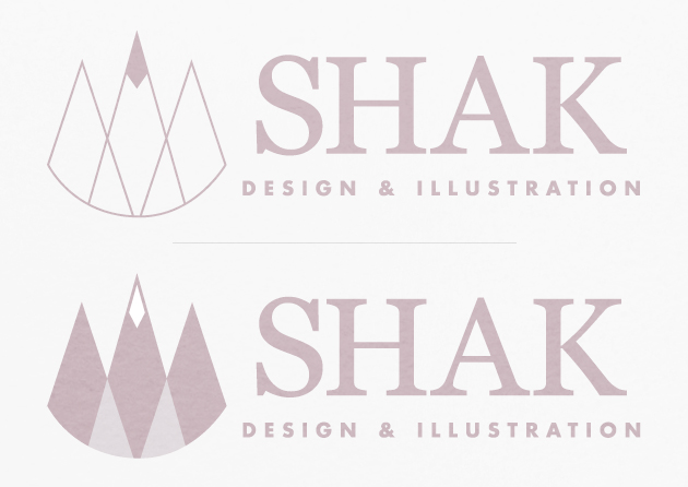
Here's the result of a three months  work: The rennovation of my own brand, the rennovation of the Shak - Design and Illustration Studio Identity. I wanted something sober and light. The symbol was thought based on three main design and art fields: Illustration, Graphic Design and Photography. Also, it has concepts of highness: The symbol was abstracted from a mountain.


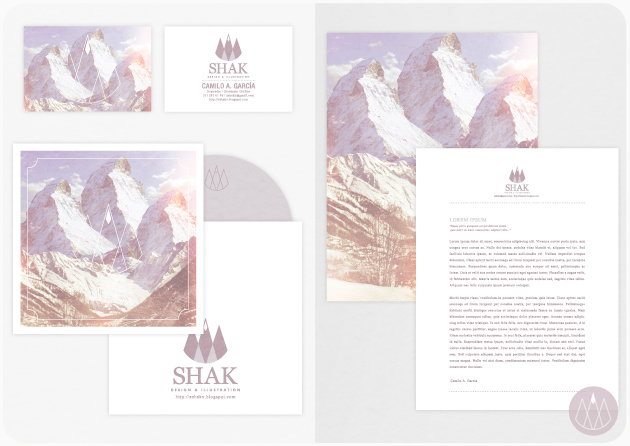
I needed a complementary graphic. Based on the Mountain concept, i bring to life the three spikes mountain:


Here's the use in Prints and Web applications (This blog and my facebook page):


VISIT & LIKE MY FACEBOOK PAGE! https://www.facebook.com/shakillustrator